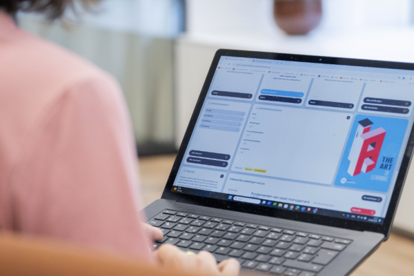
A new look for MyFA: faster, efficient and more user-friendly than ever!
Written by Febelfin Academy, 17/09/2024 • Blogposts
MyFebelfinAcademy, your trusted learning platform, has been given a thorough update. In a short webinar, you will learn all about the new user interface and functionalities of MyFA ‘new style’.
This was based entirely on extensive user feedback and testing, and the update optimises your overall user experience on the learning platform for participants, course coordinators, examiners, and instructors. This will allow you to focus even more on the essentials: learning, for yourself and for your organisation. Our common goal is the pursuit of quality and innovation.
We take complete care of your learning experience.
It was 5 years ago that Febelfin Academy launched its digital learning platform MyFebelfinAcademy, or MyFA for short. MyFA was developed in collaboration with Tobania (now Soprasteria) and manages the entire learning process for our participants and course coordinators. This is the case for both traditional and digital forms of learning, and for both individual and company-based registrations. MyFA has evolved into an open B2B model, to which organisations can connect to their own systems via API. This minimises the administrative impact on the L&D department and allows processes to be optimised.
The 2023 statistics for MyFA show there are in excess of 130,000 user profiles, over 25,000 active participants annually, and 2,000 companies.
It all revolves around you.
After a comprehensive UX/UI exercise, we are proud to present the revamped MyFA learning platform, which is now even more user-friendly. To conduct this exercise, we asked for feedback from our users: participants, course coordinators, and instructors. In collaboration with the digital agency The Reference, the new version of MyFA received a sleek, contemporary design that is not only visually attractive but also invites you to easily and intuitively navigate between the various features and sections. It allows you to effortlessly find everything you need for following a course, taking an exam, or keeping your employees' learning process on track. The learning platform's speed has also been optimised.
No two people learn in the same way, and from conversations with our users, it also turned out that everyone uses the learning platform somewhat differently, depending on their own specific needs. To cater for all these different needs, you are now able to personalise MyFA. Through the use of new accessibility options and settings, you can compose your own MyFA dashboard according to your preferences and tailored to your role(s) or function(s). This gives you an optimal overview and enables you to work more efficiently.
The underlying MyFA learning platform is not affected. The conversations with our users also revealed a generally large degree of satisfaction with the functionality of MyFA. We therefore kept the existing functionality but structured and packaged it differently. The new design provides for a user experience that is more logical, user-friendly, efficient, and – we would hope – more visually attractive.
Suggestions?
Febelfin Academy's intention with the update to the MyFA learning platform was to further optimise, support, and facilitate your learning experience. This is how we make our contribution towards the careers of financial professionals and help shape evolution within the financial sector.
Our users' input has been crucial in effecting the update of MyFA. As you explore the new MyFA, we cordially invite you to share your feedback with us via email to letstalk@febelfin-academy.be. Your feedback helps us to keep on improving and innovating in every area.
For more information about MyFA, its general functionality, the UX/UI update, or the connection options via API, we refer you to our website and the FAQ. Our BD-team will be pleased to answer any other questions you may have. If you would like to take part in an information session about MyFA, then do let our BD-team know!


